Our
work
Brand systems, pitch narratives and media for companies in aquaculture, agriculture and food. Select a project to see the scope and outcomes.
Algisys
A microalgae omega-3 biotech went through six revision rounds to land a nature-forward identity.
Read case study →- FP Aqua
FP Aqua
A plankton-sensor company chose a lighter ad-campaign package over a full rebrand - then went quiet for three months before a product illustration reappeared.
Read case study → 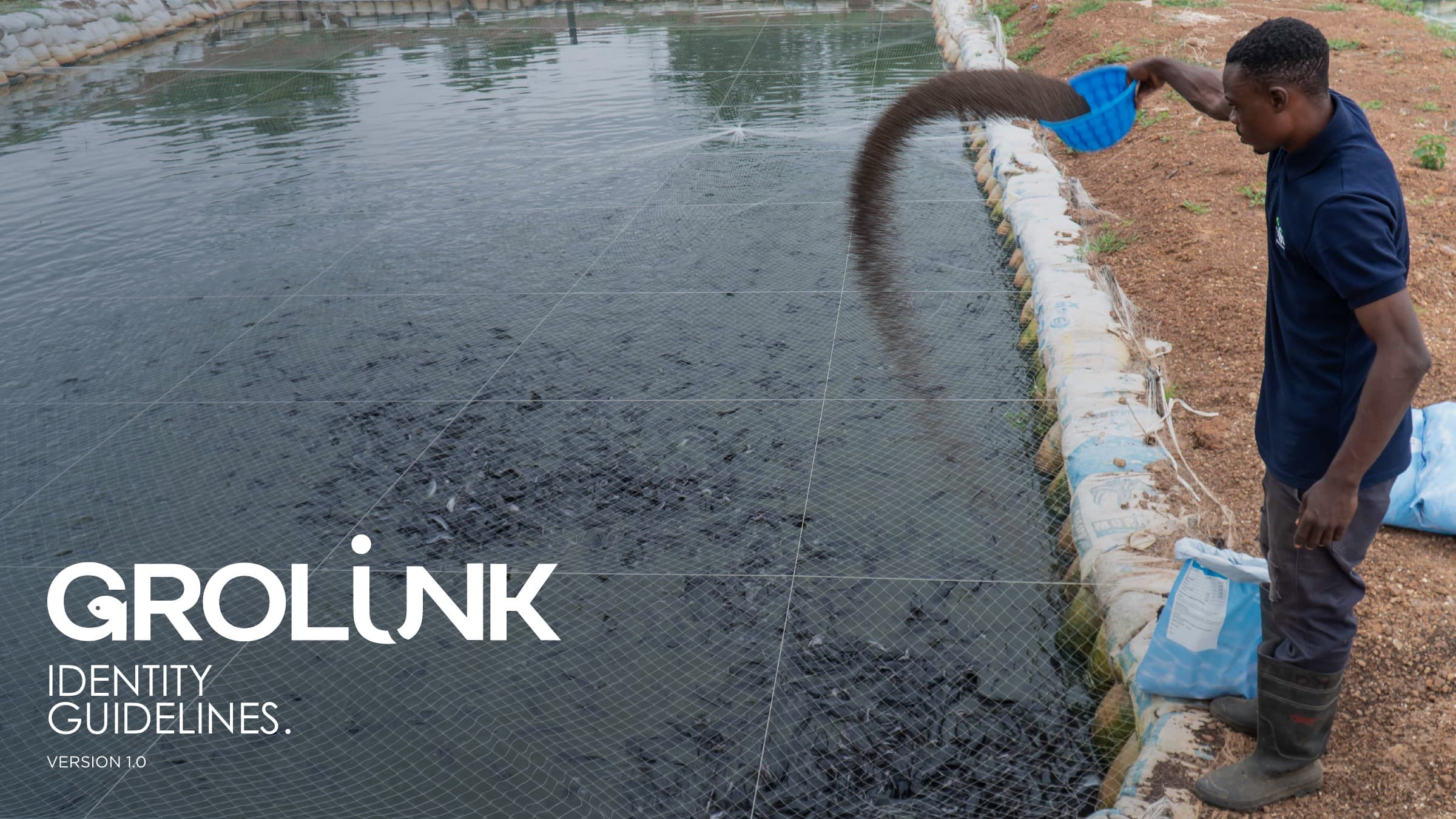
GroLink
A Nigerian aquaculture agtech company with three overlapping product names tangled into one brand. Looking to revive their parent brand; holding onto their identity and familiarity, but wanting to breathe new life and their heritage into the final look, with an aquaculture app that also need a new name and logo design.
Read case study →
Hadl
AI diagnostics for aquaculture. A startup working with tech and detail that needed to be represented in their visual.
Read case study →
MarinElixirs
An organic seaweed extract, raw material, and biostimulant producer who needed to clarify both their look and the language they used to appeal to their market (and beyond).
Read case study →
Nernst
An oxygen-generation startup with a name people misheard as ‘Dunce Electric’. We tightened its story to a single word - Nernst - and one disciplined claim.
Read case study →
Rare Earth Global
An industrial-hemp ingredients company repositioned from a carbon story to a ‘super ingredient’ story, splitting into two named sub-brands - just the beginning of building out their product offering.
Read case study →
SAFER Earth
A carbon-removal science story rewritten from scratch through live client comments, landing on a system best described 'Clean & Concise'.
Read case study →
Scape
A carbon-removal startup moved its identity from a ‘Space Invaders’ tech look to a grounded, geological aesthetic built on real basalt and volcanic-rock photography.
Read case study →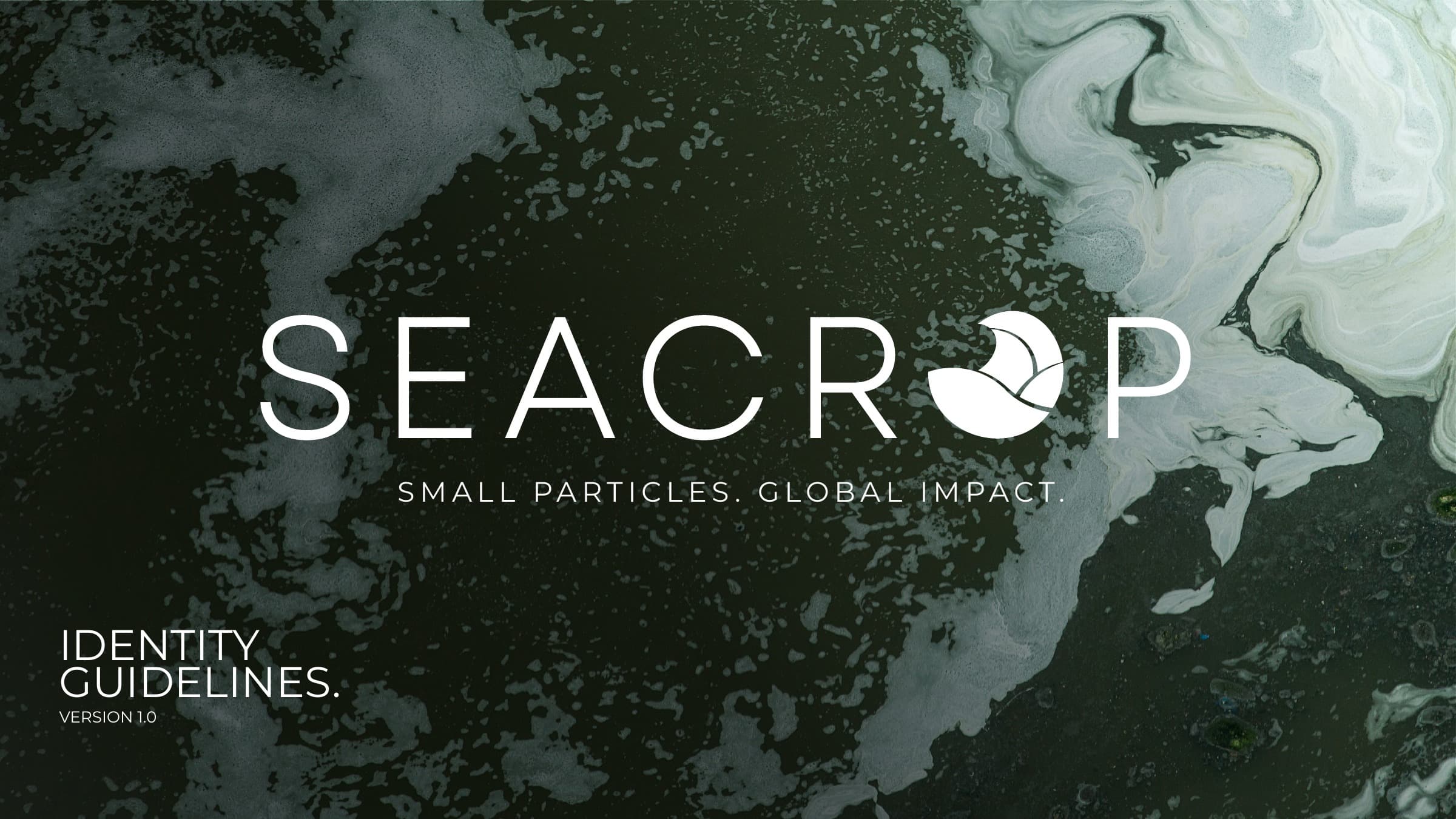
SeaCrop
A marine-phytoplankton startup rejected the obvious wave logo everyone in the category uses, choosing an abstract circular mark instead.
Read case study →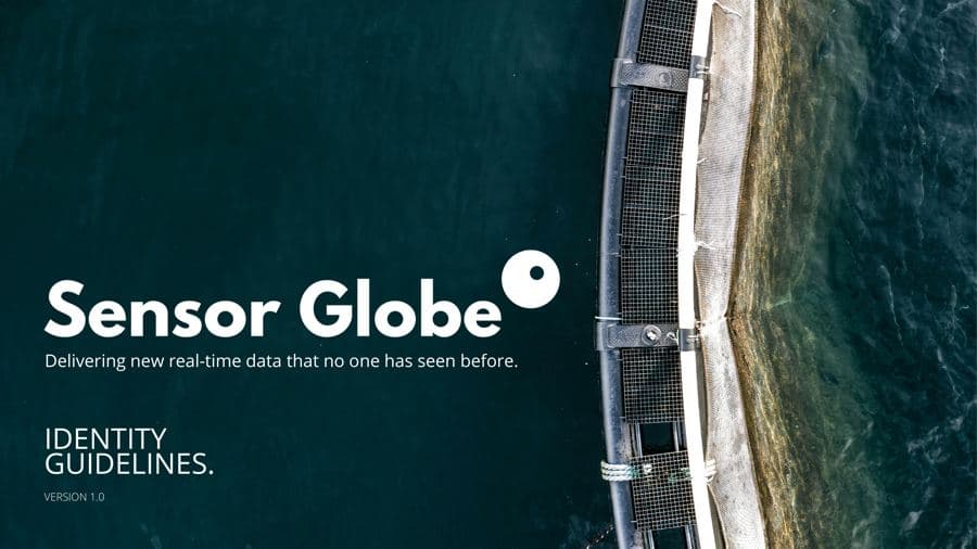
Sensor Globe
A salmon-farming sensor company traded generic ‘fish welfare’ messaging for a precise value story.
Read case study →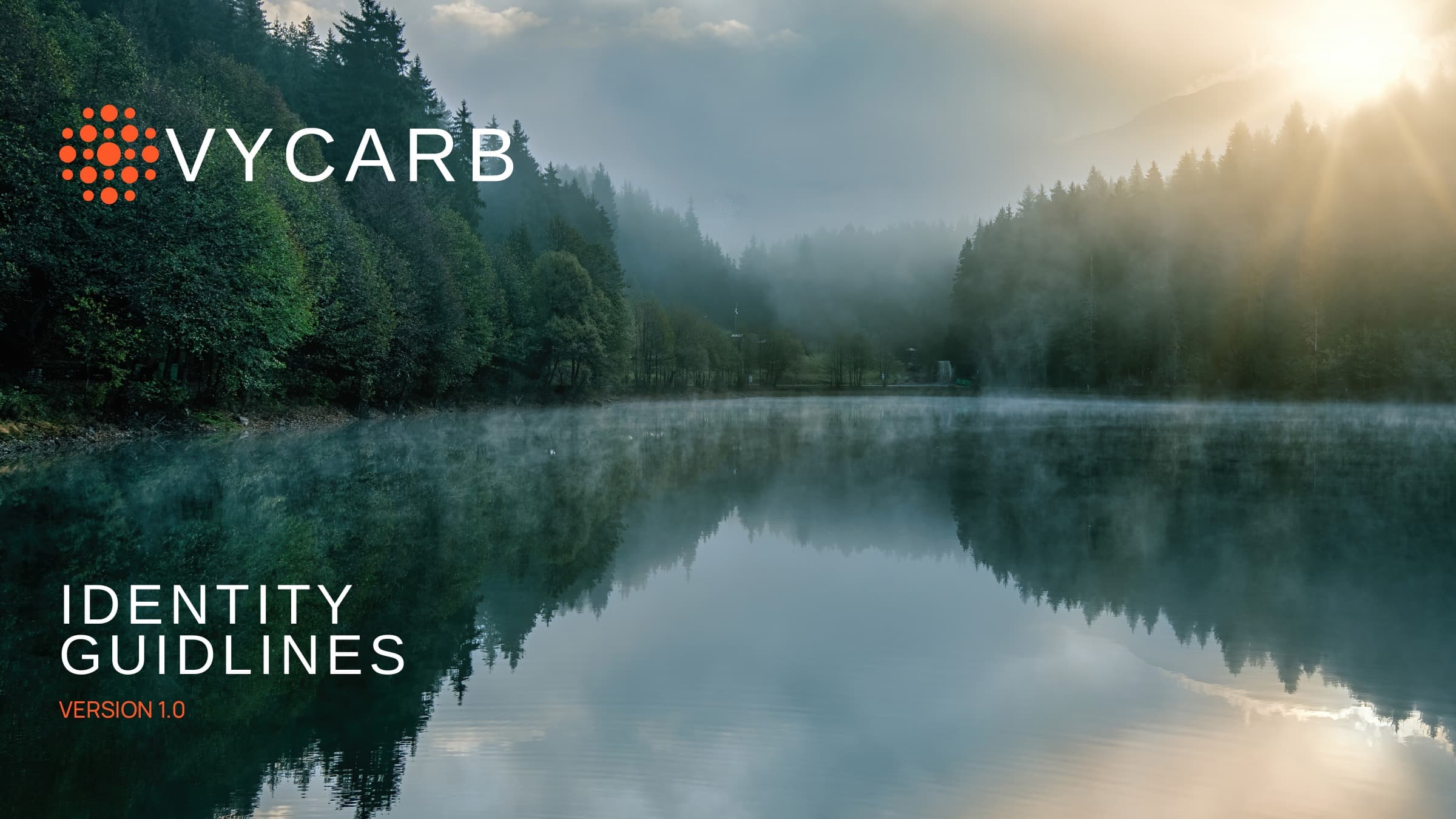
VyCarb
A carbon-capture startup traded a logo made in ‘only 10 minutes using an AI logo generator’ for a 45-page identity built to read as premium industrial equipment, not a climate startup.
Read case study →
What our
clients say
“Working with SALT was a game‑changer for Seatopia. The team dove deep into our brand (and our industry) and surfaced with design solutions that felt both razor‑sharp and unmistakably ‘us.’”
“Working with the SALT team was an absolute pleasure. The creative process we shared and the team’s ability to listen and translate that to capture the right mood, tone, and nuance through images and colors was inspiring. In a word, BRAVO!”
“Working with SALT was an incredibly positive experience from start to end. Work with them to make a striking brand that differentiates you from the rest.”
“The team demonstrated excellent communication throughout the project and consistently went above and beyond to meet our needs. I highly recommend SALT for any business looking for thoughtful design and excellent service.”
“Working with SALT has been a standout experience that significantly elevated the Sensor Globe brand.”